In my ongoing NBA analytics project, I'm mining data from the 2021-2022 season to uncover valuable insights and trends. Using Jupyter Notebook and popular libraries like NumPy, Matplotlib, Seaborn, Plotly, and Chloropleth, I analyze the data to gain insights.
To improve accessibility, I create interactive charts, graphs, and visualizations that help better understand the results. The project is a work in progress, with ongoing data analysis and updates.
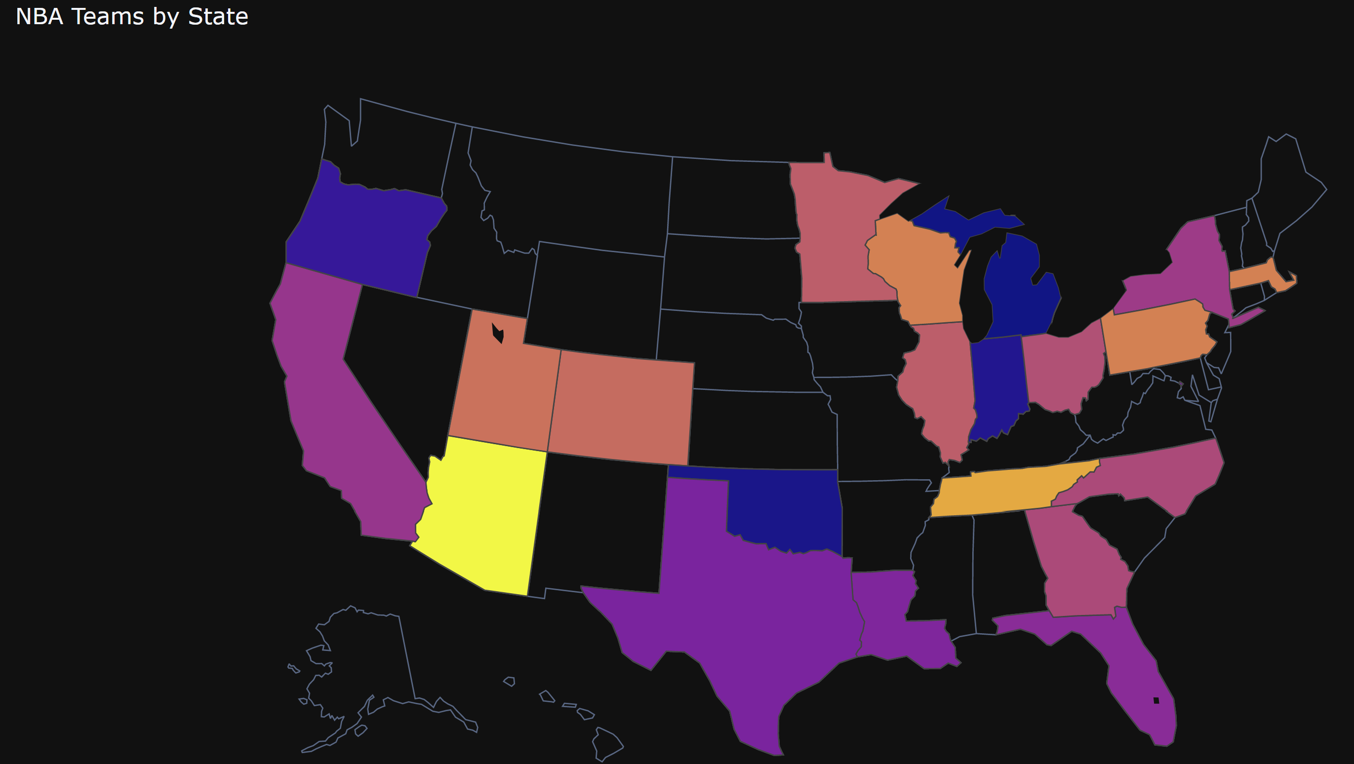
Click on the photo to interact with the Chloropleth card. Map showing NBA team average wins by state. By clicking on a status, you can see the specific average number of wins for that status. On the right side, the color scale shows how the color changes based on the average NBA team wins by state.
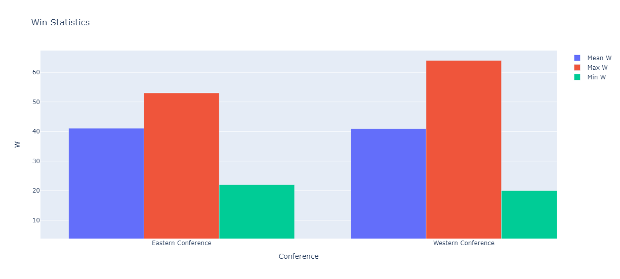
Click on the image to interact with the graph. This table provides winning statistics for the 2021-22 season, broken down by Eastern and Western conference. By clicking on the chart you can see the minimum, maximum and average values of the winning statistics for the two conferences. This interactive visualization provides an overview of the NBA team's performance during the season.
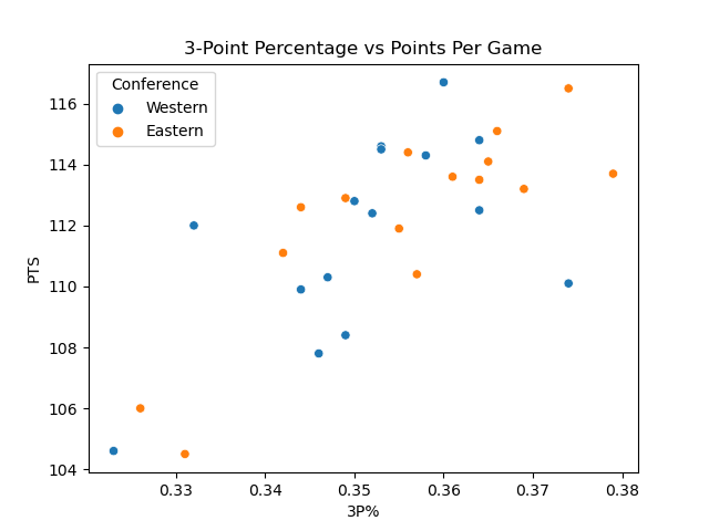
Click on the image to see various plots, showing a comparison between the Eastern and Western conferences for the 2021-22 season. Data is visualized using scatter plots and whiskers to explore NBA team performance. The scatter chart compares two conferences based on different data points, such as 3-point percentage, on-field goal percentage, assists, steals, blocks, and redirects, allowing you to correlation and potential differences between conferences. Boxed plots provide additional information on how the two conferences compare in terms of the data points in question, highlighting any significant differences that may exist.


